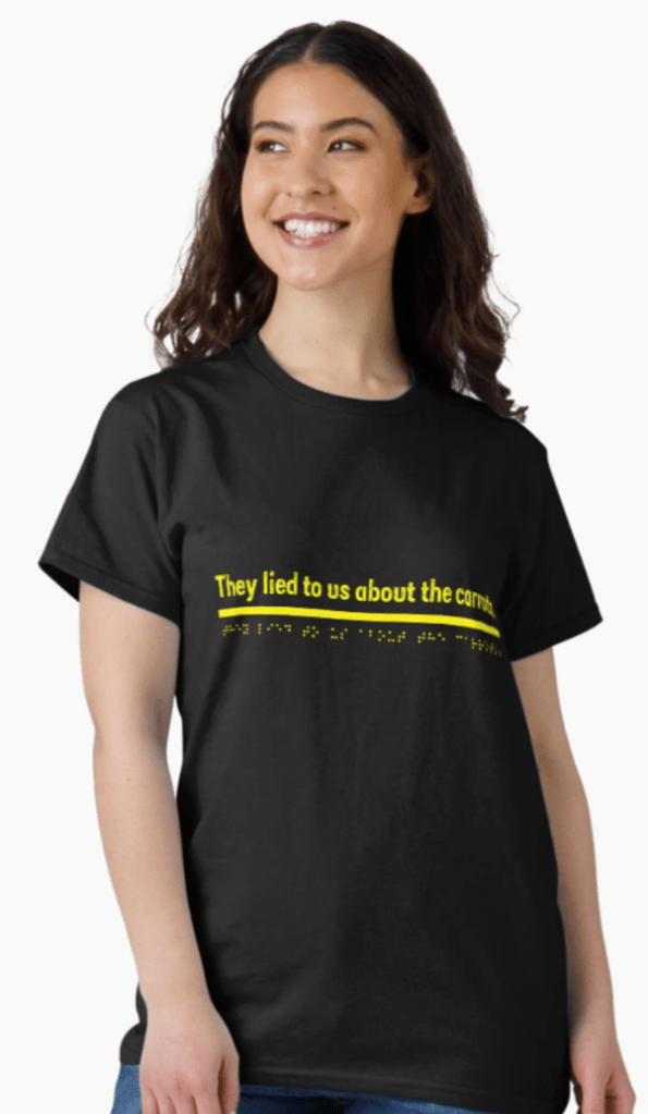
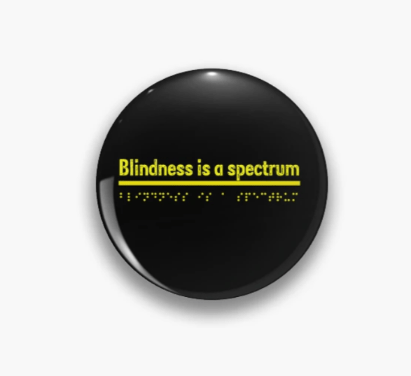

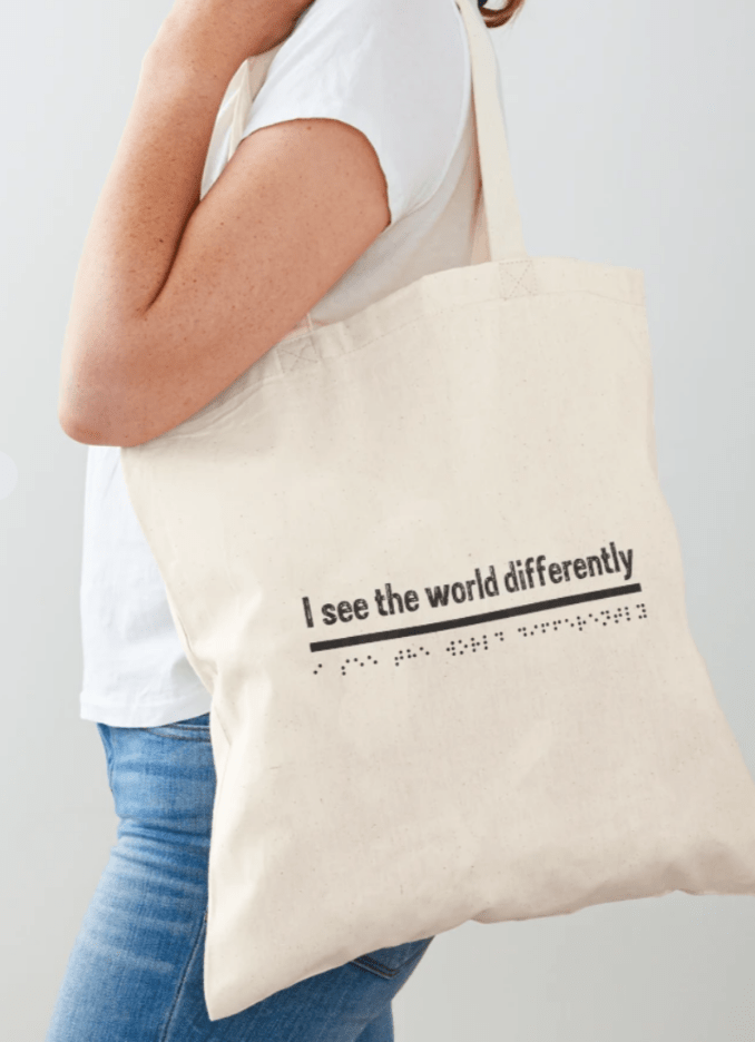
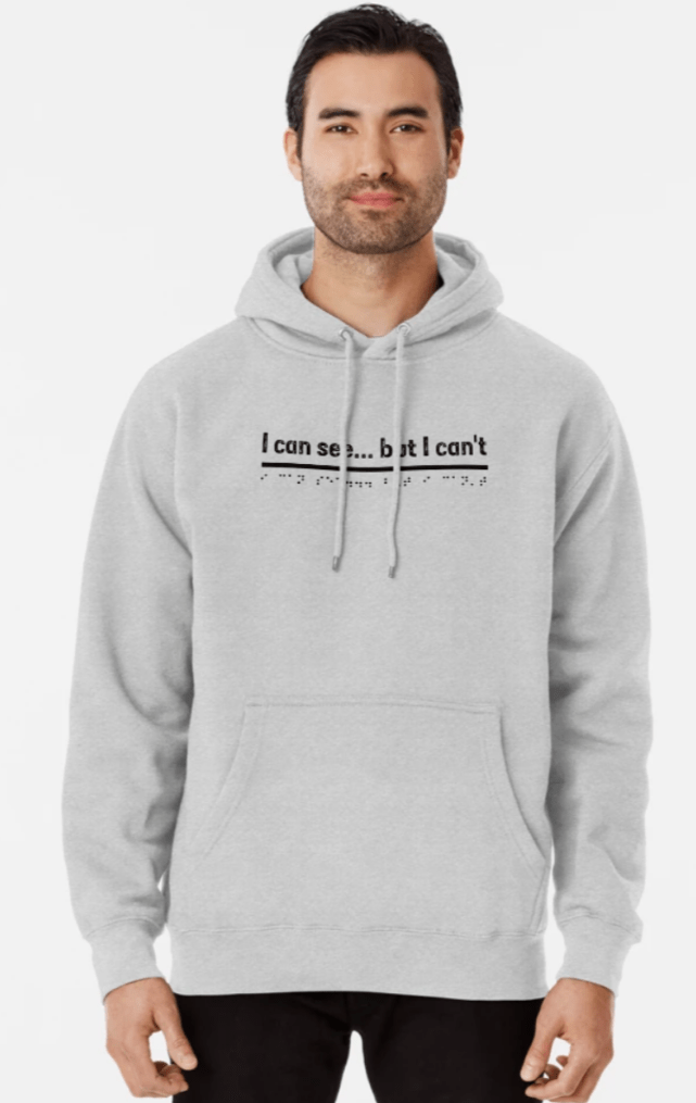
Lovely nice things on Redbubble.
I’ve designed these to spread awareness.
83 different products from water bottles, t-shirts, blankets, dresses and hats to stickers and masks.
Please take a look by clicking the link below if you’re interested 🤗
Lovely nice things on Redbubble.
I’ve designed these to spread awareness.
83 different products from water bottles, t-shirts, blankets, dresses and hats to stickers and masks.
Please take a look by clicking the link below if you’re interested 🤗

I hope you’re all enjoying the sunshine.
Please remember to protect your eyes from the harmful rays though.
I always have my Cocoon sunglasses on or handy to protect myself from damage and the suns glare.
I do still love my fantastic mirrored sunglasses, (I still have them) but cannot wear those anymore, as Cocoons help my photophobia so much. I don’t get eye pain half as much nowadays.
Even if your peepers are 20/20. Don’t take them for granted.
The light from the sun can cause all sorts of eye conditions and make the ones you already have exacerbate.
There’s more information here below. A post from 2019, but still relevant today.
Link to Protecting your eyes in the sun post
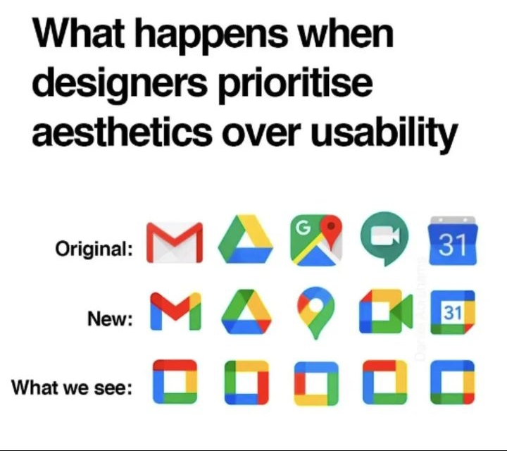
This is what happens when designers don’t think about the visually impaired people of the world.
Not taking into consideration how hard it can be looking for a particular app on a tablet or mobile phone.
Very frustrating thinking you’ve tapped on a particular app you want, to find something you don’t want has popped up.
The amount of times I’ve done the above. Especially if they are just mainly a colour. You want Facebook for instance and you get your banking app, 02 or text messages. All square. All same shade of blue.
Help over time for accessibility functions for screens are increasing mainly. In settings you can change the display, size of the font and magnification help all in a few clicks. Helpful tools to make our life easier.
However. When you’re faced with this example below. How is this going to help?
It’s hard enough as it is.