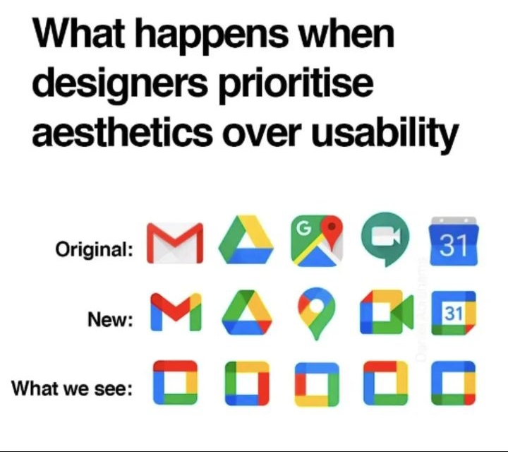
This is what happens when designers don’t think about the visually impaired people of the world.
Not taking into consideration how hard it can be looking for a particular app on a tablet or mobile phone.
Very frustrating thinking you’ve tapped on a particular app you want, to find something you don’t want has popped up.
The amount of times I’ve done the above. Especially if they are just mainly a colour. You want Facebook for instance and you get your banking app, 02 or text messages. All square. All same shade of blue.
Help over time for accessibility functions for screens are increasing mainly. In settings you can change the display, size of the font and magnification help all in a few clicks. Helpful tools to make our life easier.
However. When you’re faced with this example below. How is this going to help?
It’s hard enough as it is.